Here is a scenario that will feel painfully familiar. You are packing for a ten-day trip to Europe, and you have carefully selected what you believe are your most stylish pieces: a bold floral blouse, a pair of leopard-print trousers, a bright red cardigan, a striped t-shirt, and a floral-print skirt. Each item is beautiful on its own. But when you try to create outfits from them, you realize with dawning horror that almost nothing goes with anything else. You have packed ten individual items and ended up with approximately three wearable outfits.
This is the single most common packing mistake, and it has nothing to do with how many items you pack. It is entirely about color and pattern coordination. As someone who has spent years refining the art of the travel capsule wardrobe, I can tell you that the difference between a suitcase full of outfit possibilities and a suitcase full of regrets comes down to one thing: a cohesive color palette.
Why Random Cute Items Ruin Your Suitcase
When we shop, we tend to buy items in isolation. We see a gorgeous emerald green blouse on a rack, and we buy it because it is beautiful and it fits well. We do not necessarily think about whether it coordinates with the navy trousers and the camel blazer already hanging in our closet. Over time, our wardrobes become a collection of individual "orphan" pieces that look great on their own but refuse to play nicely together.
This problem is amplified tenfold when you are packing a travel capsule. With only nine core items, every single piece must be able to work with every other piece. One rogue item — a top that only goes with one specific bottom, or a layer that clashes with two of your three tops — breaks the entire mathematical formula of the Sudoku Packing Method and dramatically reduces your outfit count.
Step 1: Establish Your Core Neutrals
The foundation of any successful travel capsule wardrobe is a set of core neutral colors. Neutrals are the colors that go with everything: black, white, navy, camel, beige, grey, and olive. For a travel capsule, you want the majority of your pieces — especially your bottoms and layers — to be in neutral tones.
A strong neutral foundation might look like this: black wide-leg trousers, beige tailored shorts, a camel blazer, a white button-down shirt, and a navy cardigan. Notice how every single one of these items coordinates effortlessly with all the others. The black trousers work with the white shirt, the beige shorts, the camel blazer, and the navy cardigan. The camel blazer looks equally polished over the white shirt or the navy cardigan. This is the power of building on a neutral base.
Step 2: Select Your Supporting Colors
Once your neutral foundation is established, you can introduce one or two supporting accent colors. These are the colors that add personality and visual interest to your capsule without disrupting the overall cohesion. The key rule is that your accent colors must coordinate with your core neutrals.
For example, if your core neutrals are black, white, and camel, your accent colors might be a warm terracotta or a soft dusty rose. These warm tones will coordinate beautifully with the camel and white pieces in your capsule. Avoid introducing a cool-toned accent color — like a bright cobalt blue or a cool mint green — as it will clash with your warm neutral base and create an outfit dead-end.
Step 3: The "Rule of 3" for Patterns and Accents
Patterns are the trickiest element to incorporate into a travel capsule, but they can add wonderful visual variety when used strategically. The "Rule of 3" for travel packing states that you should include no more than one patterned item for every three solid-colored items in your capsule. This ensures that your patterned piece has plenty of solid, neutral partners to work with.
Furthermore, when selecting a patterned piece, choose patterns that incorporate your core neutral colors. A classic Breton stripe in navy and white is a perfect example: it is a pattern, but it is built from two of your core neutrals, meaning it will coordinate with virtually every other piece in your capsule. A bold floral in five different colors, however, is a coordination nightmare waiting to happen.
Real-Life Example: A Spring European Getaway Palette
Let's put this theory into practice with a concrete example. Imagine you are packing for a ten-day spring trip to Paris and the Italian coast. Your destination involves city sightseeing, casual beach days, and at least one or two nice dinners.
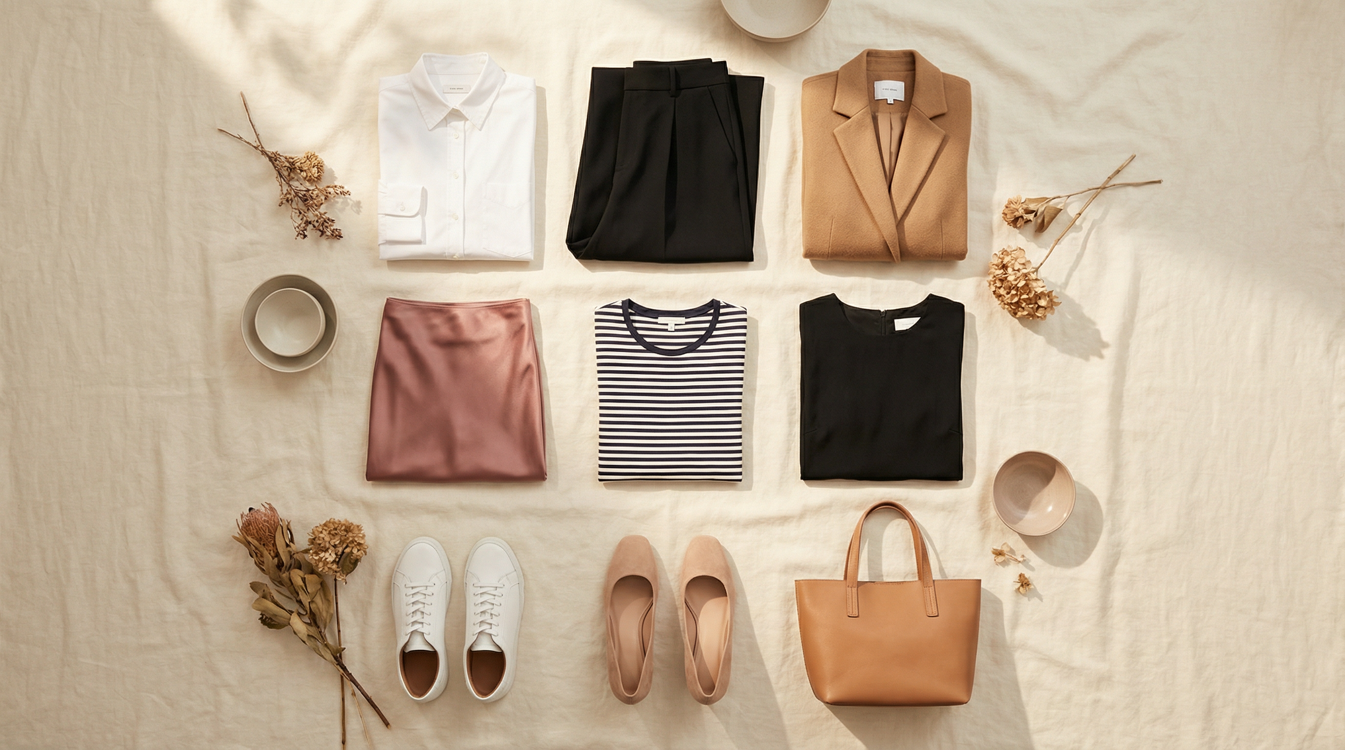
Your core neutrals: white, black, and camel. Your accent color: soft dusty rose. Your 3x3 grid might look like this:
Tops: White classic button-down shirt | Dusty rose silk blouse | Black fitted knit top
Bottoms: Black wide-leg trousers | Camel linen midi skirt | Black denim jeans
Layers: Camel tailored blazer | White linen overshirt | Black lightweight cardigan
Every single one of these nine items coordinates with every other item. The dusty rose blouse works with the black trousers, the camel skirt, and the black jeans. The camel blazer elevates the white button-down, the black knit top, and the dusty rose blouse. You have 27 mathematically distinct outfit combinations, and every single one of them looks intentional and polished.
Audit Your Closet
Before your next trip, take twenty minutes to audit your closet through the lens of color coordination. Pull out the pieces you are considering packing and lay them on your bed. Ask yourself: does every top go with every bottom? Does every layer work over every top? If the answer is no, identify the rogue piece and swap it for something that fits the palette.
The 27 Looks app shows you every outfit combination from your 9-piece grid, making it instantly obvious which pieces are color-coordinated winners and which are orphans. Download 27 Looks →
Topics
27 Looks Style Team
Our Style Team curates fashion-forward capsule wardrobes and color coordination guides for the modern traveler. We believe looking great on the road should never require a checked bag.